

Every small business operates in a number of different economies ranging from their neighborhood to worldwide. The health of these economies has a huge impact on the health of small businesses.
A business plan economic analysis should paint a picture of the economic environment your business will operate in. With many economic indicators, you can delve into further detail. Referencing information specific to small businesses in your state and industry helps to provide an even clearer context.
No, these indicators might not always paint a rosy picture. What they will do, however, is show that you’ve done your homework. That you, as an entrepreneur, understand your environment. You’ll show that you can plan around the threats you face and capitalize on the opportunities.
What to look for in a business plan economic analysis
- Small Business Employer Firms
- Proprietors’ Income
- Small Business Job Creation
- Business Births vs. Deaths
- Small Business Loan Supply and Demand
- Business Lending
- Small Business Loan Approval Rate
- Loan Charge-Off and Delinquency Rates
If you were so inclined, you could probably draw a correlation between any economic indicator and the health of your small business.
Depending on your industry, the particular economic indicators that affect your small business will vary. Whether you’re retail, manufacturing, goods, or services will make a difference.
Inspiration for these indicators was taken from the Small Business Economic Bulletin. This document is published by the U.S. Small Business Administration. Supposedly on a quarterly basis. Though, the Bulletin linked above is the most recent one I could find. It’s over six months old as of this writing.
Anyhow, I’ll work with what I’ve got. The Bulletin is a jumping-off point for the agencies that compile these statistics. I’ve covered some of these agencies before.
For each indicator addressed in the Bulletin, I’ll discuss what it measures, why (I think) it matters, and how to use the information. In the end, I’ll also touch on what (if anything) each indicator might mean for my startup.
These data are just a jumping-off point. You’ll have to dig into it further to determine what it means for your business.
Small Business Employer Firms
This indicator measures the number of small businesses that employ people.
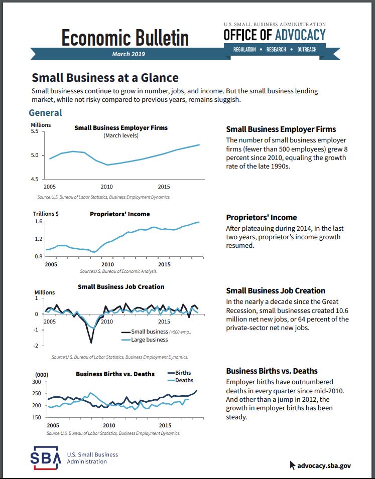
It is derived from data maintained by the BLS. Specifically, a database named Business Employment Dynamics (BDM).
Small business, for the purpose of this indicator, includes businesses with less than 500 employees. I think that includes a lot of businesses that would qualify as “mid-sized.” But, that’s just me.
An uptrend in the number of Small Business Employer Firms implies that the environment is ripe for small businesses to launch. A decline would imply the opposite.
Where possible, I always recommend digging down into regional or state information. Doing the same thing by industry is smart too. That way you get the most relevant economic statistics for your business.
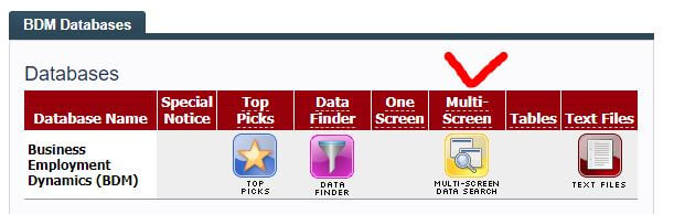
In the BDM database, the best way I found to do this is by using the Multi-Screen option for data retrieval.
You’ll notice two pairs of similar phrases if you browse the BDM. These phrases are Openings/Closings and Births/Deaths. So, what’s the distinction? I sent an email to the SBA and a tweet to the BLS.
The BLS responded quickly with a link to this page. The language is a little hard to understand. However, I think that the main difference is that Openings/Closings can include seasonal businesses. Births/Deaths are considered permanent.
The SBA, predictably, didn’t respond.
It’s my guess that this indicator is a tally of Births/Deaths. Which makes sense. Including seasonal businesses in the tally would increase its volatility. Probably better to count businesses that permanently open and close.
Proprietors’ Income
This is the aggregate amount of income earned by the owners of small businesses.
Specifically, sole proprietorships, partnerships, and tax-exempt co-ops. Dividends aren’t included in this indicator. Neither is rental income (i.e. by a landlord).
Most businesses start off as a sole proprietorship (Source). Businesses that don’t pay the proprietor enough income – die. A healthy small business environment should translate into healthy growth in Proprietors’ Income.
What if Proprietors’ Income is flat (or declining), but Employer Firms are growing? That might imply that more firms (proprietors) are fighting over shrinking pieces of the pie. If this is happening in your industry, beware.
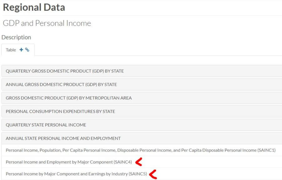
The best way I found to drill down is to look at the most current release of Personal Income by State. From there, you want to go to the Interactive Tables. Specifically, you want tables SQINC4 and SQINC5 for quarterly information. SAINC4 and SAINC5 for annual information.
Clicking on either of those should guide you to what you need. Remember, you can use Ctrl to select multiple options!
Small Business Job Creation
Job creation is a sign of growth. As customers demand more, help is needed to meet that demand.
It might come in the form of direct labor or administrative help.
Your small business may or may not follow suit. What this indicator tells us, though, is whether there is a net gain in small business jobs or not. If there is, that could be considered a tailwind. Not something that is going to guarantee success. But, not something you’re going to have to fight against either.
Here’s the flip side of that “good news” though. If small businesses (and the big boys) keep adding jobs, quarter after quarter, eventually you could reach a point where demand exceeds supply. The cost of labor goes up and (potentially) the quality goes down. For you, your suppliers, and maybe your customers.
Like Small Business Employment Firms, this indicator refers to the BDM database. Again, I suggest using the Multi-Screen Data Search to navigate it.
You can drill down by state if you choose to look at all industries and all sizes. However, some industry-specific searches can drill down by state too. I imagine it’s the bigger industries that allow for such a drill-down.
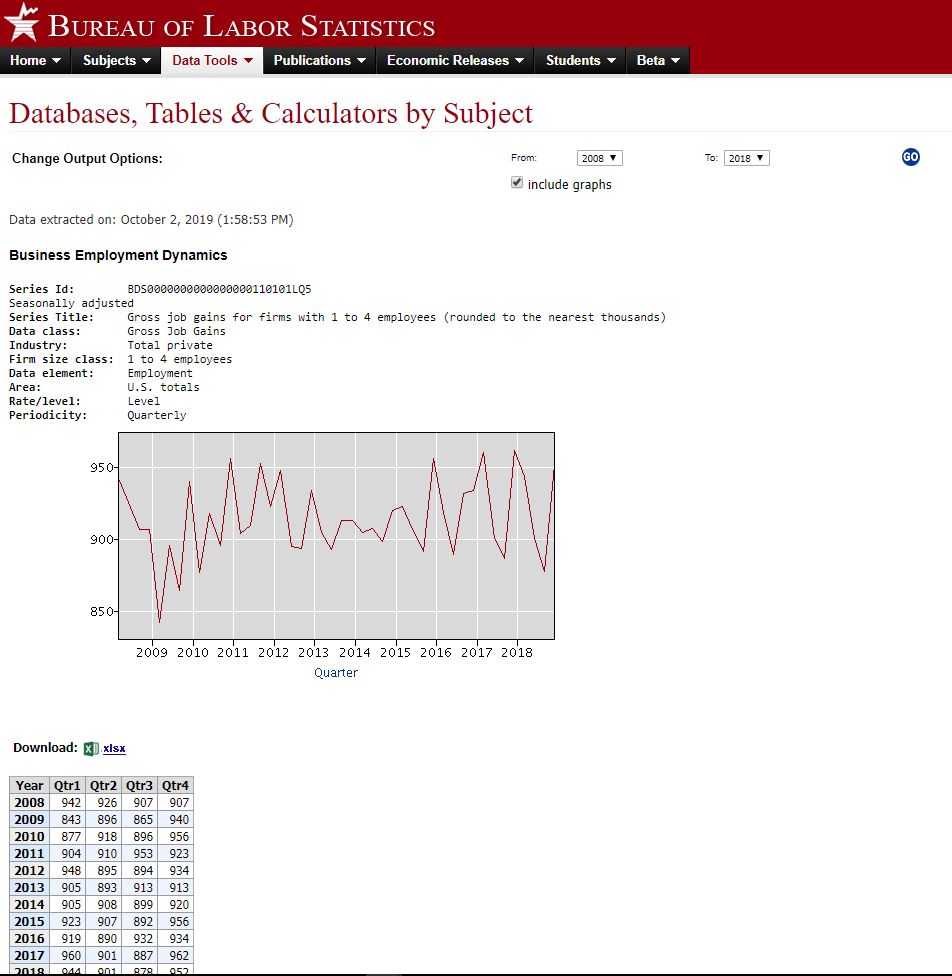
Credit: data.bls.gov
Business Births vs. Deaths
This indicator ties in directly with the Small Business Employer Firms. More Births than Deaths mean that the number of Employer Firms goes up. More Deaths than Births – down.
Once again, we refer to the BDM database. Breaking information down this way allows you to see how much of pull Births and/or Deaths are having on the number of Small Business Employer Firms. For example, is the number increasing because of more Births? Or, because of fewer Deaths?
This is just further insight into the small business environment. It might be able to provide some clue as to how ripe it is for success.
When researching Establishment Births & Deaths you can isolate by industry. But, you’ll only get totals for the whole U.S. Conversely, when looking at all industries, you can narrow down by state.
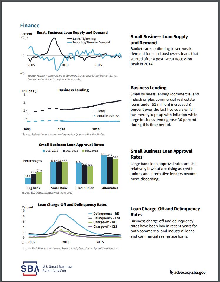
Small Business Loan Supply and Demand
This indicator measures the percentage of bankers that answered two questions in the affirmative or negative. The first question asks if banks have tightened or eased their standards on small business lending. The second question asks if the demand for small business loans has increased.
Now we shift gears a little. Away from small business employment, openings, closings, births, and deaths. The focus of the following four indicators is small business borrowing.
This indicator seems to be rather subjective. It comes from a quarterly publication by the Federal Reserve. This publication is called the Senior Loan Office Opinion Survey (SLOOS) on Bank Lending Practices.
Not a terribly objective measurement. More of “getting a feel for the room” statistic. It is just a survey, after all.
Beyond those two questions, though, there is a lot more in the SLOOS that measures bankers’ attitudes toward small business lending. Questions related to terms, collateral, covenants, and much more.
The lines on the chart seem to oscillate around 0. A negative would mean that the banker felt the opposite of what is being charted, I suppose. For example, a negative Banks Tightening figure means that more bankers answered that they were easing standards. A negative Reporting Stronger Demand line would mean that demand was weaker.
Anyhow, this indicator might provide insight into how many small businesses are seeking to employ financial leverage. Those insights can be compared with the indicators measuring expansion and contraction. If the small business environment seems ripe, but few are willing to leverage in this environment, then maybe the optimism about the future is shaky.
Don’t forget to check out the accompanying tables for a more quantifiable view of the data.
No industry or state-specific information seems to be available for this indicator.
Business Lending
This indicator compares small business loan volume to that of big business.
The Federal Deposit Insurance Corporation (FDIC) Quarterly Banking Profile is the source of this information.
Commercial and industrial loans to small businesses are measured. As are real estate loans under $1 million.
Like the Small Business Loan Supply and Demand indicator, I think this is indicative of small business owner optimism. If small business owners feel like the environment is good for investment, they are more likely to borrow. If they don’t feel like they can earn an adequate return for the risk, they will likely limit their exposure.
It’s wise to look at small business lending in several different ways. One indicator might tell you one thing. Another indicator – something else. When you get conflicting (credible) information you should investigate. You’ll hopefully come out the other end a shrewder businessperson.
Click to enlarge
Small Business Loan Approval Rates
This indicator provides valuable information two-fold. First, it gives you an idea of what the odds are of getting approved for a small business loan. Second, it breaks the approval rates down by the type of financial institution.
Granted, you don’t know the quality of the applicants measured by this indicator. That is something that would help to put this information into perspective. Are they startups or existing businesses? Maybe they aren’t adapting appropriately to changes in cash flow.
Big banks, small banks, credit unions, and alternative sources are measured. This might provide some insight as to where to go if your small business needs financing.
Unlike the other indicators, this one is more of a snapshot. Historical information is displayed. But only for the same month three and six years ago. It is not presented as a time series.
This gives you an idea of how well to prepare and where to focus your efforts when you need financing. If lenders are becoming more discerning, then you know that you’ll need to create a better business plan.
What you see in the Bulletin is pretty much all there is in the report itself. No state, industry, or size breakdown is provided.
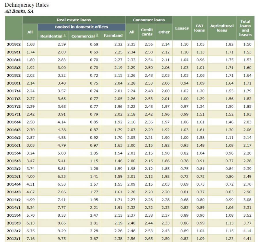
Loan Charge-Off and Delinquency Rates
This indicator gives you an idea of how effectively other businesses are employing their leverage.
Access the tables behind this indicator here.
Granted, it really only points out what percentage of businesses are doing poorly. It doesn’t say much about the upside. Only the downside.
The description of the report doesn’t outline exactly how the terms are defined.
My interpretation is that Delinquency means that one or more payments are late. Maybe even only by one day.
Charge-Off likely means that the bank has written off the loan against their reserves. They feel that payment for the remaining balance is extremely unlikely.
This serves as a lagging indicator for some of the others. I think the indicator it ties to best is Business Lending. If Business Lending is increasing, but Delinquency is level, we can assume that businesses are finding a good use for the borrowed money.
No state, size, or industry-specific information is available.
Business plan economic analysis for my startup
I don’t know if I’ll finance my startup with debt or equity. Therefore, I don’t know if the lending indicators are relevant to my business plan. If I plan on using debt financing, I can circle back and scrutinize the relevant indicators.
Right now, I don’t plan on hiring any employees. So the Small Business Job Creation indicator isn’t currently relevant either.
Of the remaining three indicators, two are somewhat redundant – Small Business Employer Firms and Business Births vs. Deaths.
I feel like the Business Births vs. Deaths indicator gives a little more insight. Let’s look at what it shows for my industry – Wholesale trade.
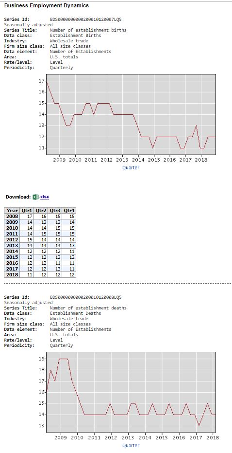
Not terribly encouraging. In 2014, Births fell below Deaths and seemed to stay there. This suggests, possibly, consolidation in the industry. Big, strong firms forcing out smaller, weaker ones.
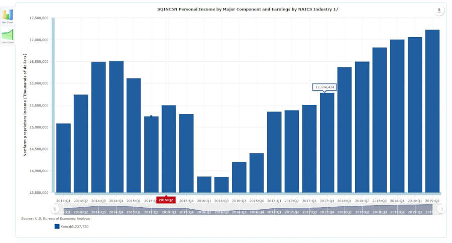
What about Proprietors’ Income?
More encouraging. Proprietors’ Income has risen sharply in my state since Q1 of 2016. Despite the title, the table doesn’t have a NAICS breakdown. But it doesn’t.
So, I don’t know the whole story. If this rise took place in my industry, I could assume that there’s plenty of money to be made. It’s just going to fewer hands. This means that I had better have a sound plan for success.
What other indicators should I have included in my business plan economic analysis?
Which indicators are important for your business plan economic analysis?